
Two shirts from the same club hang side by side in a shop. One has a badge, a sponsor and a colour scheme you've seen a hundred times. The other stops you, and you can't immediately say why. Usually it's one decision: a wider stripe, a bolder band, a hoop that sits higher than it should. Nobody remembers the safe shirt.
Stripes carry most of that weight. A Newcastle bar, a Celtic hoop and a Milan stripe are the same geometric idea at different widths, and the width does more work than any marketing campaign. Colour contrast comes second, crest placement third, trim last. Get those four right and a shirt survives relegation, rebranding and a bad season.
This list covers eight soccer teams with cool jerseys, some from decades fans still argue about and some from the current cycle. Each entry names the exact feature that makes the design recognizable, then gives you a way to spot an authentic shirt before you pay for it. You'll also get an honest read on which shirts are worth the money and which are trading on hype.
You don't need to own all eight. You need to know what you're looking at.
Table of Contents
- 1. Newcastle United (The Magpies)
- 2. Boca Juniors
- 3. Celtic FC (The Hoops)
- 4. AC Milan (Rossoneri)
- 5. Athletic Club de Bilbao
- 6. Juventus (Bianconeri)
- 7. Inter Milan (Nerazzurri)
- 8. Brazil National Team (Seleção)
- How the 8 Standout Soccer Jerseys Compare at a Glance
- Where to Start Your Own Jersey Collection
1. Newcastle United (The Magpies)
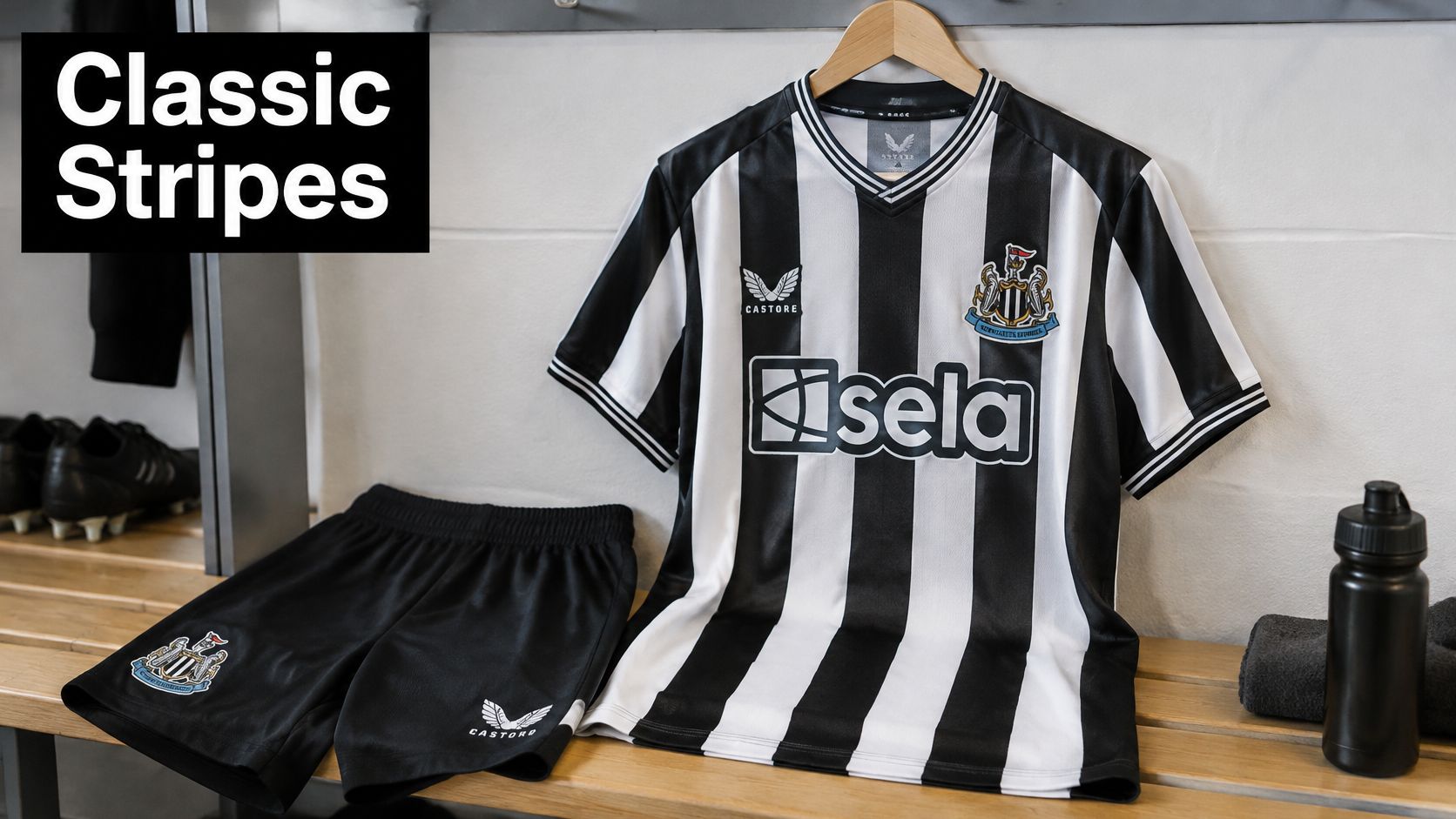
A resale listing crops the crest. The black bars still name Newcastle. The club has worn black and white stripes since the 1890s, and the shirt has barely moved: stripes, crest, collar. Nothing on top pins the design to one decade.
The contrast does the work. Black next to white stays readable from the back row of a stand and from a thumbnail on a phone. Simple, repeatable stripe shirts like this one have sold consistently well across generations of fans, because the pattern does not depend on one season's fashion.
Reading stripe width across eras
Stripe count is where reproductions fall apart. Count the black stripes across the chest before you trust the word "vintage." Wider 1990s treatments and narrower modern cuts sit at opposite ends of that range. The wrong count means a reproduction with a story attached.
Width is a trade-off. A broader bar carries further in a crowd and looks heavier on the body. A narrower modern bar sits cleaner under a sponsor and suits lighter match fabric, but it loses presence once the photo is small.
Collar shape is the second tell. A grandad collar, a winged collar and a plain crew neck each belong to a different era. Counterfeiters rarely match a collar to the stripe count they copied.
Spotting rule: count the stripes first, then the collar. The badge is the easiest thing on the shirt to fake, so judge it last.
Say you're choosing between a 1990s home shirt and a modern reissue as a gift. I would buy the older pattern if the recipient talks about the team's history. Take the current cut if they wear shirts to five-a-side and care about fabric weight.
2. Boca Juniors
You're looking at a marketplace photo of a blue shirt with one gold stripe. The first question is whether that stripe is a band or a trim. Boca's home shirt is deep blue, with a single gold band running straight across the chest and sitting high enough to cut through the crest and the sponsor rather than resting politely below them. That interruption is the identity. It looks unfinished to a neutral and unmistakable to anyone who has stood inside La Bombonera.
Band thickness is what collectors argue about. A thick band swallows the badge and starts to look like a rugby league conversion. A thin band reads as piping, and the shirt loses the Boca shape. Get the proportion right and the shirt needs nothing else, which is why copies have chased that one gold line for decades.
The shirt in motion, from the terracing.
Where counterfeits hurt most
Popular South American shirts are among the most copied in the world, and price is a major driver of that demand. A 2025 market report on football shirts notes that 40% of fans would reconsider a purchase after a price increase above 15%. Once the official price jumps, a simple blue-and-gold shirt is an easy fake to justify.
A retro reissue is the practical middle path. It carries the same blue and gold, costs less than a current player-version, and is less profitable to counterfeit convincingly. I would buy the reissue over a match-spec listing unless the seller can show the construction up close.
Three checks before you pay:
- Crest stitching: the Boca crest should be dense, with clean edges on the stars. Blurred star points mean a scanned badge.
- Band edges: on a good shirt the gold band is cut and sewn, so the edges sit slightly proud. A printed band shows a faint halo where the ink meets the blue.
- Inner labels: ask for a photo of the wash tag before buying from a marketplace seller. Refusal is an answer.
If you are still weighing which club shirt belongs in the collection, this guide to the best football club shirts is a sensible way to compare the designs.
3. Celtic FC (The Hoops)
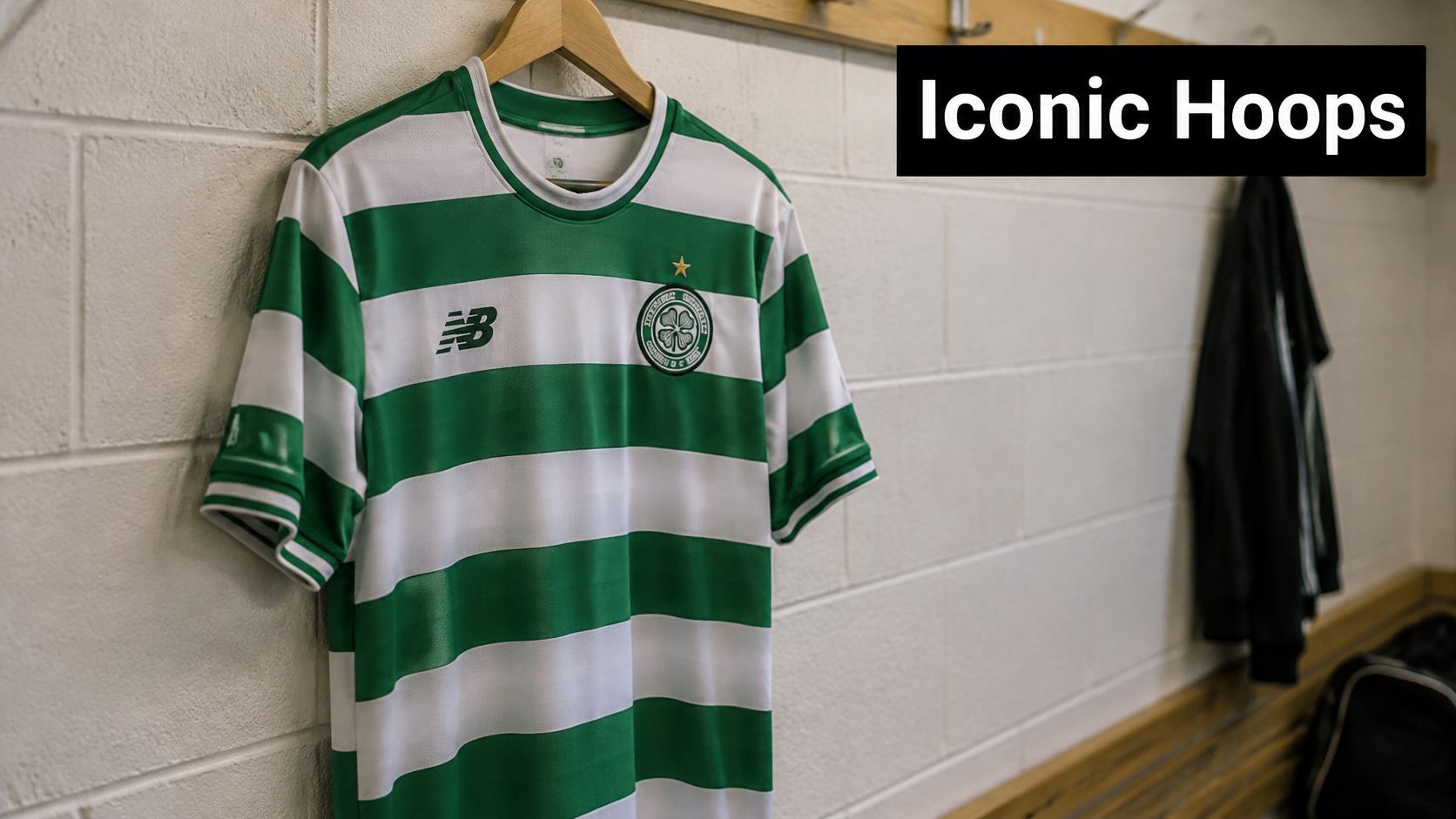
Celtic's green and white hoops are harder to get right than stripes, because hoops have no natural stopping point. Stripes end at a seam. Hoops run into sleeves, collars and side panels, and every era of the shirt solves that problem differently.
Hoop width is the identifying feature. Narrow hoops read as busier and older. Wide hoops look modern and give the sponsor room to breathe. Compare a 1980s shirt with a current one and the number of hoops across the chest dates it faster than any label.
The counterfeit problem in plain numbers
Hooped designs are easy to approximate and hard to fake well, and the scale of the fake trade explains why so many shoppers take the risk. The Athletic, citing Corsearch analysis, reports that in 2025 78% of surveyed football fans said they had knowingly bought a counterfeit shirt, with the counterfeit market estimated at £180 million and approximately 16.2 million shirts sold annually.
Practical checks that separate the two:
- Shoulder seam alignment: on an authentic hooped shirt the green band is cut and matched across the shoulder seam. On a copy it's printed straight over the stitching.
- Collar build: Celtic's collars are usually ribbed or woven, not a soft printed band, and the collar colour should be a deliberate contrast rather than whatever green was left.
- Wash label and licence tag: both should be present, legible and era-appropriate.
A hooped shirt with mismatched shoulder seams is a reject, whatever the badge says.
Suppose two 2000s home shirts are listed at similar prices. One shows crisp hoop alignment at the shoulder; the other has a band that drifts a few millimetres. Buy the first. The second will bother you every time you wear it, and it will be worth less than you paid.
4. AC Milan (Rossoneri)
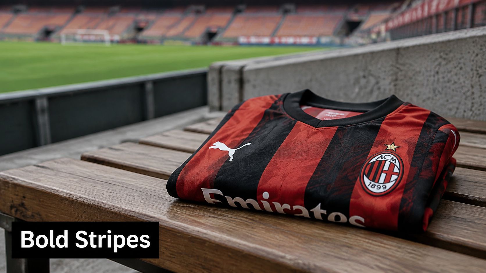
Milan's red and black stripes are the most disciplined shirt in Italy. The bars are evenly spaced, thin enough to read as a pattern rather than a flag, and the red is deep rather than bright. That restraint is why the shirt works with jeans as well as with shorts, and why so many non-football fans own one.
The detail to watch is the centre of the chest. When Milan wins Serie A, a scudetto shield sits between the stripes, and the pattern has to align around it. A good shirt cuts the stripes to the shield. A lazy reproduction prints the shield on top of a continuous pattern and hopes you don't look.
Why retro Milan sells out first
Retro demand isn't nostalgia for its own sake. Football apparel, including replica and authentic jerseys, training wear and fan clothing, accounted for about 38.6% of consumer spending in the global football merchandise market in 2025, according to DataIntelo's football merchandise market report, and the same analysis puts apparel growth at roughly 6.2% a year. A category growing that steadily doesn't leave much stock sitting around waiting for you.
That drives a simple buying order. If you want a specific Milan era, buy it when you see it in your size. Waiting for a discount on a shirt that already sells out in mid-season sizes is a losing bet.
When you're judging a vintage Milan shirt, work in this order:
- Stripe width: count the black bars across the chest and compare with photos from the season you think it is.
- Crest placement: Milan's badge sits on the left chest as worn, and its height shifts between eras.
- Sponsor logo: sponsor marks date shirts more precisely than badges do, because they change more often.
Say you're buying a 1990s Milan shirt for a friend's fortieth. Confirm the sponsor era before you commit, then ask for a close-up of the crest. Two photos settle more arguments than any listing description.
5. Athletic Club de Bilbao
A collector who already owns Milan, Inter and Juventus wants one shirt that is not Italian. I would point them to Athletic's home shirt. The colour language is different, a superstar transfer has not inflated the price, and the red and white stays put while away designs change. Buy the home, not the away.
What to check on a Bilbao shirt
Hold the shirt at arm's length. Narrow red stripes run unbroken from hem to shoulder, and the white usually takes more of the chest than the red. That contrast, not a thick bar, is what makes the kit recognizable from the stand. The crest sits high, clear of the stripe field.
Check the red in daylight. If it looks pink, the dye lot is wrong, and a wrong dye lot usually means a reproduction.
Then the badge. Athletic's crest has been redrawn across the decades. A 1980s shirt carrying a modern crest is a mash-up, not a rarity. Compare the crest with match photos from the claimed season before you trust the listing.
What to pay for: an era-correct badge on a mid-condition shirt beats a mint shirt with the wrong crest. Condition can be improved. Provenance can't.
The club fields players with Basque roots, so the shirt stands for a place rather than a brand portfolio. That suits a fan who already owns the obvious shirts. Nobody keeps three Bilbao home tops in the wardrobe, and the shirt still reads as serious football.
The place on the crest is part of judging the kit. This Bilbao culture guide for luxury travelers is the city context behind the shirt.
6. Juventus (Bianconeri)
Two black-and-white shirts hang side by side at a stall, and from six feet they look like the same kit. They are not. Juventus stripes are wider and fewer than Newcastle's, so the shirt reads as a handful of bold blocks rather than a fine pattern. Close the gap and the difference is obvious. From across the stall, ask someone to describe both from memory, and the two designs usually collapse into one.
The other tell is the trim. Juventus has used gold, silver and plain white on the crest and the sponsor frame, and that trim colour dates a shirt more reliably than the stripes themselves. Gold on the crest frame points to one era. Plain white points to another. Match the metal, or the lack of it, before you trust the listing.
When a player changes what a shirt means
A design can become collectible in a single transfer window. A star's arrival can cause a sharp, short-lived spike in shirt sales. That changes how you buy. A shirt tied to a debut season, a first title or a famous arrival holds value a plain version of the same design doesn't. If you're buying one Juventus shirt, buy the one attached to a moment.
Moment shirts cost more and sell through faster. A plain home shirt in the same stripe pattern is easier to find and easier to date, because no special print is fighting the design.
Checks that matter on Juve shirts:
- Stitch density at the hem: thin, loose stitching on a shirt this simple is a warning sign, because there's nothing else to hide behind.
- The stars above the crest: they count title milestones, so their number and placement date the shirt.
- Label era: the inner label style should match the season, not the decade.
Buying rule: with a design this plain, everything visible is a test. If the stripes, trim and label don't agree on an era, walk away.
7. Inter Milan (Nerazzurri)
Inter's black and blue stripes shouldn't work as well as they do. Blue and black sit close together in value, so the pattern can look muddy from a distance. What saves it is the blue itself. Inter has used brighter, almost electric blues in some eras and deep navy in others, and the shirt lives or dies on that choice.
Modern kits lean bright. Older shirts lean dark. That's the fastest way to date a shirt from a photograph, before you get anywhere near a label.
Spotting a vintage Inter shirt
Three things, in order:
- Stripe count and width: consecutive eras keep the stripes similar but never identical, so count the black bars and match them to a season.
- The badge: Inter's crest has been redrawn several times, and the shape of the outer circle is the giveaway.
- The sponsor: sponsor marks change more often than badges, which makes them the most precise dating tool on the shirt.
The badge tells you the decade. The sponsor tells you the year.
Worked example. You find two 2010-era home shirts at a similar price, one with a sharp crest and one with a soft, slightly fuzzy badge edge. Buy the sharp one. Crest print quality degrades before fabric does, and a fuzzy badge on a modern shirt usually means the shirt is a copy made from a photograph.
If you're weighing whether an older Inter shirt is worth the spend, this guide to retro football shirts as an investment covers resale, condition grading and what holds value.
8. Brazil National Team (Seleção)
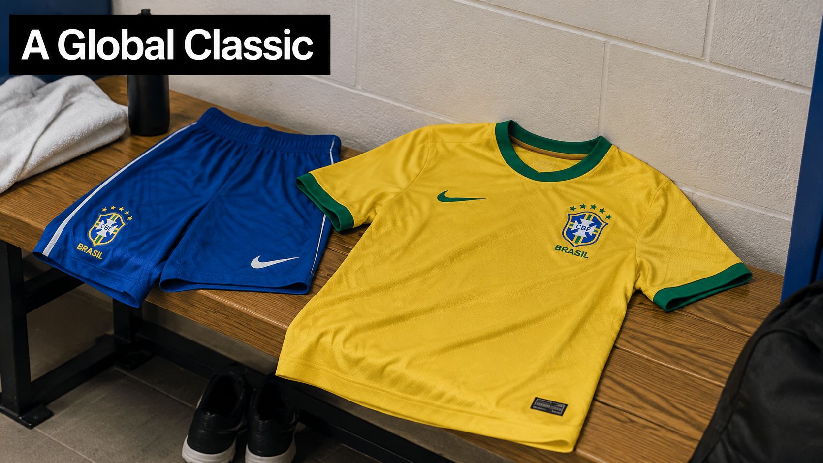
Brazil's yellow shirt is one of the most copied national kits, and contrast is the reason. Yellow body, green trim, blue shorts: three strong colours doing three separate jobs. The eye sorts them at distance. Many national shirts settle for two colours. Brazil uses three and still looks simple, because the yellow field stays large and the green stays trim.
The yellow itself is the trap. It has shifted between a warm gold and a harder lemon across the decades. A shirt that looks orange under indoor lighting is usually a bad dye lot, not a rare variant. Check it in daylight before you pay extra for a "special" shade.
Why the yellow travels
The shirt's reach is commercial as much as cultural. Mordor Intelligence's football merchandise market analysis puts Europe at roughly 37.6% of market share in 2026 and forecasts Asia-Pacific as the fastest-growing region at about 6.5% compound annual growth through 2032. A yellow Brazil shirt sells across those markets. That makes the home shirt a safe gift or a first shirt, and a less distinctive buy once a collection already has one.
Buy the home shirt when you want instant recognition. If you want something that stands out on a rail, take a Brazil away or goalkeeper shirt instead.
Checks before you buy:
- Stars above the crest: they count World Cup titles, so the number dates the shirt to an era rather than a specific year.
- Green trim: collar and cuff trim should match in shade and sit as a narrow edge, not a wide band. Mismatched greens mean mixed dye lots.
- Tags and badge build: a common sign of a copy is a heat-pressed badge on a shirt that should carry embroidery. Original labels should still be on the shirt.
The same contrast test applies to the coolest goalkeeper jerseys, usually the boldest design on the pitch and one of the easiest shirts to date from colour blocking alone.
How the 8 Standout Soccer Jerseys Compare at a Glance
Line these eight shirts up and the split is the pattern, not the club name. Vertical stripes dominate. Celtic is the hoop. Boca is one gold band. Brazil is a solid yellow ground with green trim.
| Item | Signature Design | Key Colors | Best For |
|---|---|---|---|
| Newcastle United (The Magpies) | Heritage vertical stripes | Black and white | Classic style and heritage kit collectors |
| Boca Juniors | Deep blue shirt with a single high gold band across the chest | Blue and gold | Fans of bold colors and Argentine football heritage |
| Celtic FC (The Hoops) | Iconic hooped shirt | Green and white | Fans and collectors who love distinctive patterns |
| AC Milan (Rossoneri) | Classic vertical stripes | Red and black | Italian football fans and collectors |
| Athletic Club de Bilbao | Traditional vertical stripes | Red and white | Heritage shirt buyers and fans of Basque identity |
| Juventus (Bianconeri) | Zebra-style vertical stripes | Black and white | Collectors and fans seeking a versatile classic |
| Inter Milan (Nerazzurri) | High-contrast vertical stripes | Black and blue | Fans of bold, classic designs |
| Brazil National Team (Seleção) | Bright shirt with green trim | Yellow, green, and blue | Fans seeking a globally recognized kit or a colorful gift |
I sort by the signature design before I look at the price. Newcastle and Juventus share black and white, so a photo that does not show a heritage stripe set versus a zebra pattern is a pass. Celtic is the only hoop here, which makes a vertical-stripe listing easy to reject. Boca fails the same check if the gold runs top to bottom instead of as one high band on a deep blue chest.
Where to Start Your Own Jersey Collection
Every entry on this list comes down to four things you can check in ten seconds. Stripe width. Hoop proportions. Colour contrast. Crest placement. Learn to read those and you can judge a shirt you've never seen before, at a market stall or on a marketplace listing, without needing anyone's opinion.
Start with one club whose look you like. Buying eight shirts in a month is how collections end up full of pieces you'd never wear. One shirt you've researched, with era-correct details, teaches you more about the market than ten impulse buys.
Check before you commit. Ask for a photo of the inner wash label, confirm the badge construction and look at the shoulder seams where the pattern should be cut and matched. Sellers who won't send those photos are telling you something useful.
Prioritize retro eras if you want shirts that stand out. A current shirt says you follow the season. A shirt from a specific era says you know why that season mattered, and it usually costs less than a match-spec version of the current kit.
Judge the design, not the hype. The most expensive shirt in a shop isn't automatically the best-looking one. A visually unusual shirt at accessible official pricing is a better buy than a limited release that only works on a hanger.
Buy your size in the era it was cut. Vintage sizing runs small, so measure a shirt you already own and compare the chest and length numbers rather than trusting an S, M or L label.
If you prefer discovering designs rather than chasing them, Mystershirt sells 100% authentic jerseys with original labels and tags, which takes the guesswork out of the authenticity checks above.
If you'd rather be surprised than scroll through listings, Mystershirt packs mystery boxes with authentic club shirts that arrive with the original labels and tags still attached, and you can name the clubs, leagues or colours you'd like to avoid before your order is prepared. Boxes start at $33.32 across Premium, Retro, Kids and Sharing options, with sizes from children's to 5XL and a 100-day money-back guarantee. Start with one box, read the club card inside, and let your collection grow around the designs you didn't know you wanted.