The loudest shirt on the rack isn't automatically the best buy. That's the mistake most lists of the coolest goalkeeper jerseys encourage, and it's why collectors end up with shirts that photograph well but don't fit, don't last, or weren't rare to begin with. Judge the shirt in front of you, not its hype.
Table of Contents
- Why the Coolest Goalkeeper Jerseys Are Not Always the Loudest
- How Goalkeeper Jerseys Became Visually Distinctive
- The Four Criteria That Make a Goalkeeper Jersey Cool
- Fabric and Fit Choices That Decide Wearability
- Color, Visibility and the Functional Side of Style
- Why Goalkeeper Jerseys Are More Collectible Than You Think
- How to Spot an Authentic Goalkeeper Jersey
- Choosing Between a Targeted Grail and a Surprise Box
Why the Coolest Goalkeeper Jerseys Are Not Always the Loudest
Most roundups rank famous shirts by personal taste and nostalgia. That's fine for browsing, but it doesn't help when you're spending money, buying a gift, or choosing a shirt a child will wear. A neon patterned classic and a plain modern shirt can both be cool, just for different reasons.
Use four questions instead of one reaction. First, is it visually distinctive on the pitch and off it? Second, does it carry historical significance through a player, tournament, or era? Third, can you wear it comfortably in everyday life? Fourth, is a genuine example scarce, or does it only look collectible?
What changes when you score instead of rank
A bold vintage design may win on visual impact and cultural memory but lose on fit, fabric, and availability. A minimalist current shirt may look quiet in photos yet score higher for comfort, pairing with jeans, and playing five a side. Neither answer is wrong. They're different purchases.
Collector's rule: Taste tells you what you like. Criteria tell you what you're paying for.
That distinction matters most for newer collectors and gift buyers. If the recipient wants a wearable shirt, don't buy an oversized vintage cut just because it's famous. If they want a display piece with a story, don't settle for a plain current replica and call it equivalent.
How Goalkeeper Jerseys Became Visually Distinctive
Goalkeepers look separate because the rules made them separate. Their colors were historically regulated to separate them from outfield players and opponents, with early shirts limited largely to scarlet or royal blue). Green was added as an approved option in 1912, after which it became the dominant goalkeeper color for much of the early 20th century, according to that same kit history.
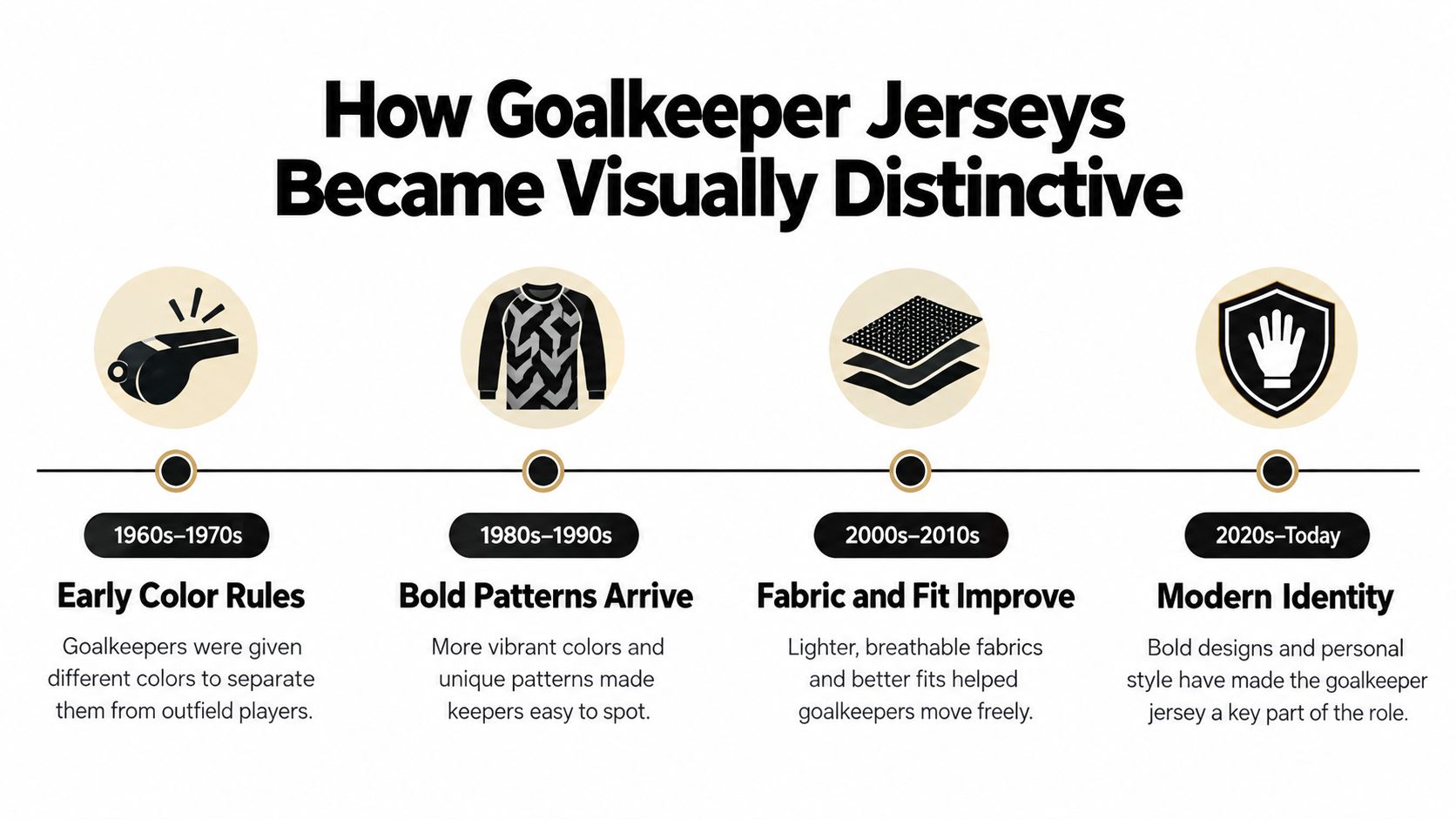
The timeline below shows how a regulated shirt became an expressive one.
At international level, the International Football Association Board ruled in 1921 that goalkeepers commonly used yellow or black, reinforcing a separate visual identity. Numbering added another marker. England used numbered shirts internationally in 1937, numbered jerseys appeared at the 1938 World Cup in France, and every player at the 1954 World Cup in Switzerland received a unique squad number. Those milestones are traced in the kit history linked above, so treat them as the chain that tied the number 1 to the goalkeeper, even though football law doesn't require that number.
From restriction to expression
Restrictions relaxed gradually during the 1970s. Designers could then use bright geometric patterns, fluorescent shades, and multicolor panels that earlier keepers couldn't wear. That's why era identification is often possible from color, numbering, and pattern alone.
This short video helps you spot those shifts in real shirts rather than in abstract dates.
When you see a restrained green shirt, you're seeing the old regulated logic. When you see a clashing patterned shirt, you're seeing what happened after that logic loosened. Both looks have a reason, and that reason is part of the appeal.
The Four Criteria That Make a Goalkeeper Jersey Cool
Score each shirt out of the same four boxes before you compare prices. Coverage of vintage goalkeeper kits notes they were especially distinctive from the early 1990s through the early 2000s, with unusual colours, textures, and oversized silhouettes, while newer designs moved toward slim-fit, technical, fluorescent, or monochrome styles. That contrast shows why one ranking can't suit every buyer.
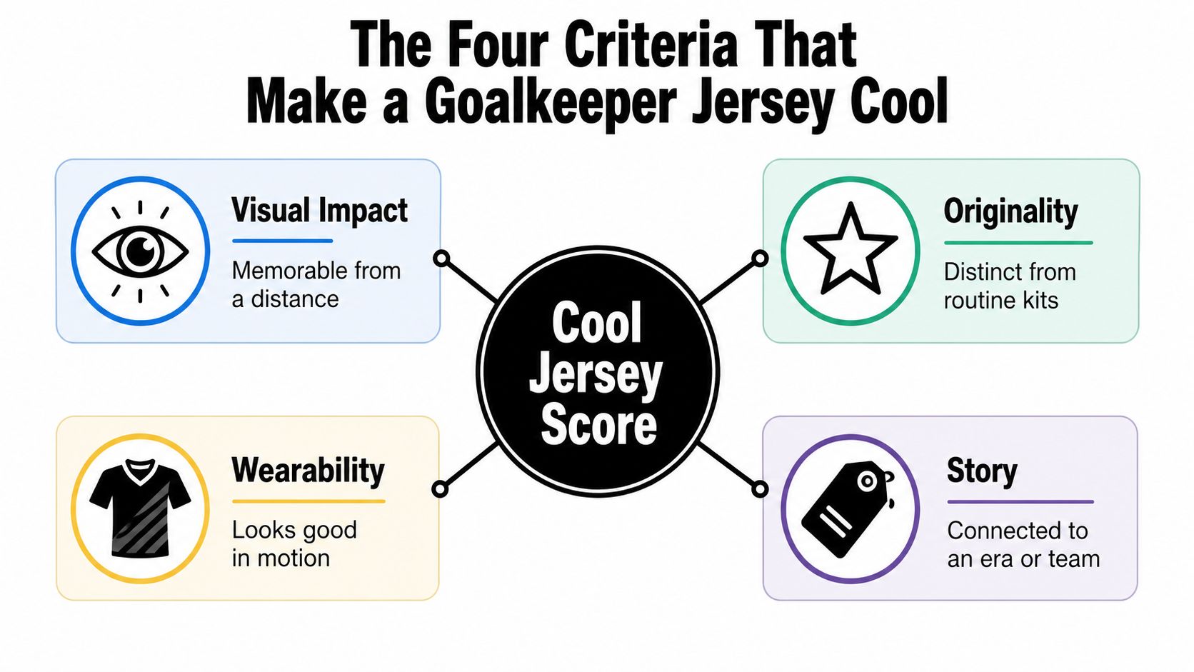
- Visual distinctiveness: Judge pattern intensity, color contrast, and separation from green grass and outfield kits.
- Historical significance: Look for a defining player, match, tournament, or design era, not just age.
- Everyday wearability: Check cut, fabric, sleeve length, and whether it works beyond matchday.
- Collector scarcity: Separate low original production from a modern design made to look old.
A historical example that is not just about color
Peter Shilton's shirts show why story can outweigh pattern. His 125 England caps between 1970 and 1990 and 20-year international span link his grey 1990 World Cup shirt and grey-and-blue 1986 World Cup quarter-final shirt to landmark moments. A quiet grey shirt can therefore outscore a louder shirt with no player association.
Use the same test on any club or national-team design. If you're broadening out from keepers, cool soccer shirt designs across outfield kits give a useful comparison point for pattern and color. The keeper shirt should still stand apart from its own team's outfield kit. If it doesn't, its visual score should fall.
Fabric and Fit Choices That Decide Wearability
A goalkeeper shirt can look striking on a rack and feel clammy on the pitch. For technical wear, fabric and construction matter more than a bold graphic. Research on sportswear fabrics found that synthetic fibers such as polyester, nylon, acrylic, and polypropylene transfer sweat toward the garment's outer surface. Knitted-fabric porosity also affects how a shirt absorbs, spreads, and dries moisture.
The study compared an inner layer made of 90% polyester and 10% elastane with several cotton-containing alternatives. That specific layer had lower water-vapor resistance, indicating better breathability and heat dissipation in the tested setup. In practical terms, vapor can escape more readily, which may help reduce a clammy feel. Elastane also allows the fabric to stretch as you dive or reach overhead.
What to check on the label and in your hands
- Lightweight polyester knit: A sensible starting point for training and warm weather.
- Mesh or ventilated panels: Check the sides, back, and underarms, where heat can build up.
- Close but nonrestrictive fit: Raise both arms. The hem should not pull sharply upward.
- Graphic weight: Heavy prints and brushed interiors can impede vapor transfer and hold heat.
A dense vintage shirt may suit display or casual wear in cool weather, while a lighter technical knit is a better match for summer training. Even choosing craft materials with Display Guru reflects the same basic principle: material properties should fit the intended use. For a keeper jersey, check how the fabric feels, how freely you can move, and whether the graphics add stiffness.
Don't buy a heavy retro shirt for playing just because you love how it looks. Buy it for wearing, and buy a technical shirt for sweating.
Color, Visibility and the Functional Side of Style
Color isn't only decoration for a goalkeeper. Research examining football-kit visibility found dark colors such as black and green can be less detectable against playing surfaces. A separate study reported small differences associated with jersey color and cited prior penalty research linking red kits to fewer goals conceded, in that same source.
Don't overread that evidence. It doesn't establish a universal performance advantage for one color, and effects are context-dependent and sometimes modest. Treat color as a visibility and identity feature, not a guarantee that you'll save more penalties.
A practical way to choose
| Priority | Better direction | Why it helps |
|---|---|---|
| Recognition in a crowded box | Fluorescent yellow, vivid orange, saturated red | Creates clear separation from grass and bodies |
| Everyday styling | Black, navy, or muted green | Pairs more easily away from the pitch |
| Collector display | Bold blocking or contrasting sleeves | Reads clearly from a distance and in photos |
High-contrast patterning can work if the overall shape still reads as one clear silhouette. A mostly dark green shirt on green grass is the obvious problem case. Contrasting sleeves or a bright torso panel can solve it without turning the whole shirt neon.
For kids' matches and amateur games, visibility deserves extra weight. Defenders, referees, and parents on the touchline need to find the keeper quickly. For a framed shirt, pick the design you love. The function changes, so the scoring should change too.
Why Goalkeeper Jerseys Are More Collectible Than You Think
A goalkeeper shirt can be collectible for reasons beyond its pattern. Older examples were often made in smaller quantities because only one or two players wore them, so fewer replicas were sold, as this account of goalkeeper shirt production explains. That limited supply can make authentic vintage shirts harder to find, but scarcity alone does not make one desirable.
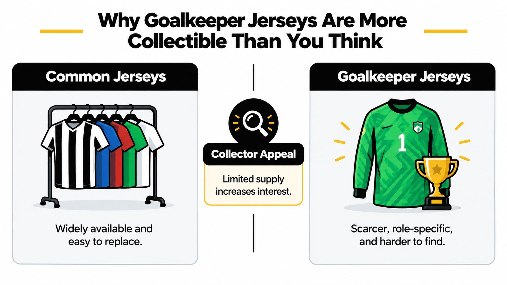
The modern market works differently: goalkeeper designs now make up a more visible part of retail ranges. Their style has also shifted, from the bold, abstract patterns associated with the 1990s to more minimalist looks. So a loud vintage shirt and a restrained modern one can both appeal, for different reasons. Use four criteria to judge either: visual distinctiveness, historical significance, everyday wearability, and collector scarcity. They help separate a personal favorite from a shirt with stronger collecting appeal.
Scarcity is not the same as value
An old shirt may be hard to find yet still be a poor purchase if it is damaged, the wrong size, or lacks a meaningful link to a player or competition. A newer design may be widely available but make more sense for regular wear. Judge the whole shirt, not just its age.
- Player association: A connection to a defining goalkeeper can give a shirt added significance.
- Competition: A tournament or title connection gives its history more context.
- Provenance: A documented ownership or match story can support a premium.
- Size and condition: Wearable sizing and clean condition can make a shirt appealing to more buyers.
Market reality: Retro styling is a design choice. Genuine scarcity comes from limited production. Treat them as separate qualities when weighing a shirt's appeal and price.
That distinction helps avoid paying a vintage premium for a modern design. A newly made shirt with a striking retro pattern can still be a good buy, provided it is presented and priced as a modern shirt, not rare original stock.
How to Spot an Authentic Goalkeeper Jersey
Run the checks before you negotiate, not after you've fallen for the pattern. Start with manufacturer details and season-specific labels, then compare sponsor typography with confirmed shirts from the same season. Country of manufacture, stitching, and label fonts should be consistent with that era and maker.
A fuller walkthrough of how to check if your football shirt is authentic helps when photos are limited or a seller is vague. Ask for close images of labels, wash tags, crest stitching, sponsor edges, and any numbers or names. Blurry photos are a reason to pause.
Red flags that should end the conversation
- Mismatched details: Sponsor lettering, crest shape, or sleeve patches don't match the claimed season.
- Modern label, vintage claim: A recent production tag undermines an original-era story.
- No provenance at a premium price: Match-worn claims need evidence, not confidence.
- Condition hidden in photos: Cracking, bobbling, stains, and loose stitching affect value.
Consider a striking shirt listed as vintage. The pattern looks period-correct, but the inner label, fabric, and sponsor print point to a modern reproduction. That doesn't make it a bad shirt. It makes it a modern retro shirt, and it should be priced as one.
Condition needs the same honesty. A genuine shirt with heavy print cracking may suit a budget collector who wants the design. It shouldn't command the price of a clean example in a wearable size.
Choosing Between a Targeted Grail and a Surprise Box
You now have two sensible routes, and they suit different people. A targeted grail hunt means naming the exact shirt, era, size, and condition you want, then waiting for the right example. A surprise route means setting boundaries and letting discovery do part of the work. Neither route is more serious. They solve different problems.
When a targeted grail makes sense
Choose the hunt when historical significance is your top score and only one shirt will do. You may be chasing a keeper from your childhood, a tournament you remember clearly, or a design that completes a themed collection. You'll need patience, a firm ceiling price, and enough knowledge to reject close copies.
Build a short target sheet before you search. Write the season, maker, sponsor version, sleeve length, size range you'll accept, and flaws you won't tolerate. That sheet stops you from buying a near match at midnight and regretting it in daylight.
If you can't describe the exact shirt you want, you're not ready for a grail hunt yet. You're still exploring.
Exploration is not a weakness. Many collectors start by learning which eras, cuts, and color families they reach for most. A few wearable purchases teach you more about your taste than months of saved listings.
When surprise is the better teacher
Choose a curated surprise when you want discovery, gifting ease, or a broader collection without researching every listing. It also suits parents and gift buyers who know size and broad preferences but don't know one specific season. Reading about how a football jersey mystery box works can clarify whether that trade-off fits you.
Set boundaries either way. Decide your budget, preferred fit, colors to avoid, and whether authenticity for display or comfort for playing matters more. A surprise shouldn't mean no standards. It should mean flexible club or design preferences within clear limits.
- Pick one era first: Regulated classics, expressive vintage designs, or minimalist modern shirts.
- Pick one job first: Playing, everyday wear, gifting, or display.
- Score before spending: Visual impact, story, wearability, and scarcity.
- Verify before premiums: Labels, typography, stitching, condition, and provenance.
Start small and learn from the shirt you receive or find. Try it on, note the fabric and cut, and record what you'd change next time. That single feedback loop improves your second purchase more than any ranking can.
The coolest goalkeeper jerseys for your collection are the ones that score well on your criteria, not someone else's list. A grey shirt tied to a landmark career, a fluorescent shirt built for visibility, and a clean monochrome shirt you wear weekly can all earn their place. Buy the reason, not just the color.
Start your keeper collection with an authentic surprise from Mystershirt, where mystery boxes let you choose your size and note clubs, leagues, or colors to avoid. It's a low-risk way to discover which eras, fits, and color families you love before you chase a specific grail.