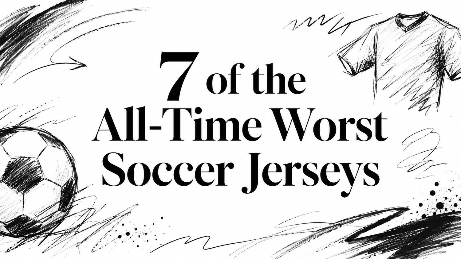
Football has a special gift for turning bad ideas into folklore. One shirt can annoy a city, confuse a back line, or make a proud club look like it got dressed in the dark. Cardiff City's switch from blue to red is the sharpest proof that kit design isn't trivial. Fan backlash reportedly ran at over 70%, and attendances dipped roughly 6 to 8% during the rebrand period before the club returned to blue in 2015, as summarized by this Paste Magazine piece on infamous soccer kits.
That's why the Hall of Shame matters. In football, greatness gets bronze statues. Infamy gets polyester, strange collars, baffling color palettes, and patterns that should've been stopped by one sensible adult in a meeting room. These are the worst soccer jerseys that went past mere ugliness and became legends, cautionary tales, and, with enough time, cult collectibles you'd secretly love to pull from a mystery box.
Table of Contents
- 1. #7 Manchester United's 'Invisible' Grey Kit (1995-96)
- 2. #6 Coventry City's Brown Away Kit (1978-79)
- 3. #5 CD Palencia's 'Anatomy' Kit (2016)
- 4. #4 Hull City's 'Tiger Print' Home Kit (1992-93)
- 5. #3 Athletic Bilbao's 'Ketchup' Kit (2004-05)
- 6. #2 Fiorentina's 'Swastika' Away Kit (1992-93)
- 7. #1 Colorado Caribous' 'Fringe' Kit (1978)
- 7 Worst Soccer Jerseys Comparison
- From Cringe to Collector's Item
1. #7 Manchester United's 'Invisible' Grey Kit (1995-96)
A bad shirt usually embarrasses supporters. This one also got accused of sabotaging the players. Manchester United's pale grey away kit has become the textbook case for what happens when designers fall in love with “sleek” and forget that footballers need to spot each other at speed.

The Design Crime
The problem wasn't just that it looked bland. The pale grey fabric and faint white details created weak contrast, and the shirt became notorious because players and broadcasters complained that United were hard to distinguish. ESPN's retrospective on the “invisible grey” fiasco explains how the kit was later remembered as one of the game's great visual failures, and why poor contrast can fall below broadcasting-friendly visibility standards in practical terms, as discussed in ESPN's look at Manchester United's invisible grey kit.
That's the thing about the worst soccer jerseys. Some are ugly. Some are unusable. This one managed both.
The Backstory
The shirt entered football mythology because it became tied to a public collapse. United changed out of it at halftime in that famous Southampton match, and the kit instantly graduated from “odd design choice” to “cursed object from a sporting ghost story.”
Practical rule: If a shirt disappears because people can't properly see it, the design team hasn't made a fashion statement. They've made camouflage.
If you enjoy seeing the opposite done well, these best football club shirts show how color, identity, and readability can work together. Even a printing discussion like DTF printing tips for heather grey reminds you that grey is a dangerous color when contrast is weak.
The Legacy
Collectors adore it now, of course. Not because it's beautiful, but because it tells a story in one glance. Pull this from a mystery box and you're not just holding fabric. You're holding proof that a football shirt can lose the plot before kickoff.
2. #6 Coventry City's Brown Away Kit (1978-79)
Some football shirts are remembered for glory. Coventry City's brown away kit is remembered because it looked like football had wandered into a puddle and decided to stay there. In an era that produced some bold, charming eccentricity, this one chose the glamour of damp cardboard.

Mud, but make it football
Brown can work in fashion, interiors, and a decent pair of boots. On a football pitch, it's a high-risk choice. Coventry didn't soften it with clever trim, bold contrast, or any playful detail. They just went straight down the middle of the color swamp.
That's why this shirt still appears in conversations about the worst soccer jerseys. It wasn't provocative in an artistic way. It was just drab, flat, and visually joyless. Put it beside the brighter away kits of the period and it looks like the one shirt that arrived at the party after everyone else had already gone home.
- The color failed first: Brown didn't flatter the club, the crowd, or the television picture.
- The design offered no rescue: With no striking pattern or strong accent, the shirt had nowhere to hide.
- The mood was all wrong: Football kits should announce themselves. This one muttered.
Why collectors still love it
For shirt nerds, this kind of disaster is irresistible. The ugly ones often have more personality than the sensible ones. A clean, competent away shirt can be forgotten in a season. A brown Coventry effort becomes a pub quiz answer for life.
Some jerseys become classics because they're beautiful. Others become classics because nobody can believe they were approved.
If a mystery jersey collector unwraps this one, the first reaction is usually laughter. The second is respect. There's something almost heroic about a shirt being this committed to a terrible idea.
3. #5 CD Palencia's 'Anatomy' Kit (2016)
Most clubs say their players will “give everything” for the badge. CD Palencia decided to illustrate the point with an anatomy lesson. The result was a shirt that looked less like sportswear and more like someone had peeled away the skin and gone straight to muscle tissue.

A shirt from the biology lab
As a bit of graphic execution, it was impressive. As a football jersey, it was unhinged. The shirt and shorts combined to create a skinless-human effect, which is not generally what supporters want while eating a pie before kickoff.
This is one of those modern worst soccer jerseys that proves the line between creativity and gimmick is very thin. The concept shouted louder than the club. Once that happens, the shirt stops being a uniform and becomes a stunt.
Viral, yes. Wearable, no
Palencia got attention. Plenty of it. But attention alone isn't the same as admiration. A shirt can go around the world online and still look ridiculous on an actual pitch under actual floodlights.
Collector's insight: The best weird shirts still feel like football shirts. The anatomy kit felt like a dare.
That's also why collectors keep circling back to unusual tops with a stronger balance of novelty and design, like the pieces featured in these cool soccer shirts designs. Palencia's entry remains famous because it crossed the line that most clubs merely wave at from a safe distance.
Its legacy is half joke, half masterpiece of bad judgment. You laugh, then stare, then laugh again.
4. #4 Hull City's 'Tiger Print' Home Kit (1992-93)
Hull City are the Tigers. Sensible clubs use a nickname as inspiration. This shirt used it as a full decorating scheme. The 1992-93 home kit didn't nod to tiger imagery. It pounced on it, rolled around in it, and then demanded everyone admire the result.
When a nickname takes over the room
The all-over tiger-stripe look was so loud that the rest of the shirt barely stood a chance. Crest, sponsor, trim. Everything had to fight for oxygen against a pattern that looked like it belonged on a discount sofa in a very ambitious nightclub.
And yet, there's a kind of sincerity to it. Hull didn't accidentally make a ridiculous shirt. They committed to a ridiculous shirt with the confidence of a club that believed football should sometimes be a bit daft.
- Too literal: Turning “Tigers” into wearable fur was a brave but perilous leap.
- Too busy: The eye didn't know where to land.
- Too memorable: Which, for collectors, is often a backhanded compliment.
The cult-classic twist
Bad kits start to become interesting. Hull's tiger print wasn't merely unsuccessful. It became beloved because it captured a wild era of design when restraint was treated like a minor illness. The shirt is impossible to ignore, which means it has already beaten many tidy modern templates that nobody remembers a month later.
If you're opening a mystery jersey box, this is the sort of pull that starts a ten-minute story on the spot. Nobody says, “Ah yes, another perfectly fine plain shirt.” They say, “Good grief, it's the tiger one.”
That's immortality of a sort.
5. #3 Athletic Bilbao's 'Ketchup' Kit (2004-05)
Athletic Bilbao once asked contemporary art to design a football shirt and got a result that looked like lunch had gone badly wrong. The infamous “ketchup” kit tried to be profound. Supporters looked at it and saw stains.

Art attacked the laundry basket
The abstract red splashes on white were supposed to make the shirt into a cultural statement. In theory, fair enough. Bilbao is a club with identity, pride, and history. But theory is a dangerous place. On cloth, the design looked chaotic and unpleasant, like a white shirt that had met a very dramatic plate of pasta.
This is one of the clearest examples of a jersey forgetting its first duty. A football shirt must work as a team uniform before it dreams of becoming gallery material. Once fans start giving it condiment nicknames, the battle is usually lost.
When the museum piece beats the match shirt
The odd beauty of this failure is that it became more famous because it was rejected than it ever would have been if it had quietly done a season's work. It survives in memory as a fascinating misfire, proof that clubs can aim for originality and still end up in parody.
A great shirt can contain art. A bad one makes the players look like they've walked through it.
Collectors love this kind of thing because it captures a very specific ambition. Not just “let's sell shirts,” but “let's reinvent what a shirt can be.” Admirable impulse. Awful outcome. That combination is catnip for anyone who collects football oddities.
6. #2 Fiorentina's 'Swastika' Away Kit (1992-93)
Some bad shirts are funny. This one isn't. Fiorentina's notorious away kit is remembered because its geometric pattern created an association no club would ever want near its crest, history, or supporters.

The pattern that should never have passed
On first glance, it was just a busy purple design from an era that loved busy purple designs. Then people noticed the repeating shapes. Once seen, the resemblance was impossible to dismiss, and the kit became a cautionary tale in the harshest possible way.
There was no need for elaborate analysis after that. Whatever the intention, the visual effect was catastrophic. It showed how pattern design can go wrong when nobody steps back and asks the simplest question in the room: what does this look like when repeated, folded, stretched, and seen in motion?
A lesson every designer should remember
This shirt sits high on any list of worst soccer jerseys because it failed at a level deeper than taste. It triggered revulsion rather than mere mockery. That moves it from “bad design” into “serious design failure.”
Collectors still discuss it because rarity and infamy tend to travel together. Anyone interested in the loud, risky spirit of that period can also browse 90s soccer jerseys and see how many bold patterns worked brilliantly when they were handled with care.
Patterns don't just decorate a shirt. They create meanings, whether the designer intends them or not.
Fiorentina's kit remains the warning pinned to the studio wall. Test everything. Then test it again.
7. #1 Colorado Caribous' 'Fringe' Kit (1978)
There are ugly football shirts, and then there is the Colorado Caribous fringe kit. This isn't just the worst soccer jersey because it looked strange. It's the worst because it appears to misunderstand, at a fundamental level, what a football shirt is for.

Cowboy couture meets football confusion
The beige and brown base was already flirting with trouble. Then came the leather fringe across the chest, as if the club wanted to field a team of midfielders and one saloon piano player. It looked like sportswear designed by a costume department that had only been given Westerns to study.
Unlike many infamous kits, this one didn't need context to look absurd. You could show it to someone who has never watched football and they'd still know something had gone wildly off course.
- The materials looked wrong: Fringe belongs on jackets, not match kit.
- The silhouette looked wrong: The shirt read as costume before uniform.
- The whole concept looked wrong: Football was only loosely involved.
The all-time champion of bad ideas
And yet, what a magnificent piece of nonsense it is. The North American Soccer League had a flair for spectacle, and the Caribous delivered the sort of shirt that guarantees immortality through disbelief. The club may have been brief, but the jersey is eternal.
This is why collectors chase disasters as eagerly as classics. The best shirts tell you how football wanted to look. The worst tell you how far football was once willing to wander off the map.
7 Worst Soccer Jerseys Comparison
| Item | Design Complexity 🔄 | Production & Resources ⚡ | Expected Outcome ⭐ | Ideal Use Cases 💡 | Legacy / Impact 📊 |
|---|---|---|---|---|---|
| #7: Manchester United's "Invisible" Grey Kit (1995–96) | Low, simple low‑contrast color choice | Low, standard manufacturing, no extras | ⭐ Very poor, impaired player visibility and performance | Not suitable for competitive play; novelty discussion only | 📊 High notoriety; cautionary example about function over style |
| #6: Coventry City's Brown Away Kit (1978–79) | Low, plain, drab color selection | Low, basic materials and construction | ⭐ Poor, unappealing, quickly retired by fans | Not recommended; collectible for novelty value | 📊 Persistent reputation as one of the worst color choices |
| #5: CD Palencia's "Anatomy" Kit (2016) | Medium, detailed anatomical printing | Medium, custom graphic printing required | ⭐ Mixed, generated viral attention but widespread ridicule | Short‑term PR stunts or attention‑grabbing campaigns | 📊 Memorable marketing flop; lesson on over‑prioritizing shock value |
| #4: Hull City's "Tiger Print" Home Kit (1992–93) | High, all‑over, high‑contrast pattern | Medium, patterned printing, legibility issues | ⭐ Mixed, polarizing but highly memorable | Brand expression, retro merchandise, cult releases | 📊 Cult classic; sought after for novelty and nostalgia |
| #3: Athletic Bilbao's "Ketchup" Kit (2004–05) | Medium, abstract/artistic motif | Medium, artist collaboration, nonstandard print | ⭐ Poor, rejected as distracting and unwearable | Museum/display or anniversary art piece, not matchwear | 📊 Artistic experiment that failed practical tests; archived |
| #2: Fiorentina's "Swastika" Away Kit (1992–93) | High, complex geometric pattern with unintended symbols | Medium, standard production but failed vetting process | ⭐ Very poor, major PR disaster, withdrawn mid‑season | None, requires rigorous pattern review before release | 📊 Severe controversy; rare and valuable but infamous |
| #1: Colorado Caribous' "Fringe" Kit (1978) | High, unconventional materials and embellishments | High, custom materials (fringe), impractical for sport | ⭐ Very poor, impractical, distracting, not functional | Theatrical promotions or novelty museums only | 📊 Iconic example of worst‑practice in sportswear design |
From Cringe to Collector's Item
The strangest truth about the worst soccer jerseys is that time softens almost everything except boredom. A bad kit can survive ridicule if it has nerve, identity, or a story no one forgets. That's why the shirts on this list still matter. Manchester United's grey kit showed that visibility matters as much as style. Cardiff City's red rebrand proved supporters will revolt when a club severs itself from its own history. Coventry's brown, Hull's tiger print, Palencia's anatomy experiment, Bilbao's ketchup art piece, Fiorentina's disastrous pattern, and Colorado's fringe fever all failed for different reasons, but none of them failed unnoticed.
And that's the key. The worst jerseys often become better collector's items than the merely decent ones. A plain, competent shirt might do its job and vanish into the archive. An outrageous one hangs around in memory, in resale photos, in pub arguments, and in the grin of whoever finds it unexpectedly. Football collecting isn't only about elegance. It's about stories stitched into cloth.
That's why the mystery jersey experience fits this world so well. The fun isn't just pulling a beautiful shirt from a famous club. It's getting a piece of football history with some weirdness baked into it. Maybe it's a lovely retro template. Maybe it's a glorious oddball. Maybe it's the kind of shirt that makes your mates laugh before they ask to try it on.
There's a bigger lesson here too. Great kits respect function, club identity, and the supporter's eye. Terrible ones usually ignore one of those pillars, and the legendary disasters ignore all three. Yet even then, football fans rarely throw them away from memory. We turn them into folklore.
That instinct also explains why collectors browse everything from pristine classics to niche curiosities, and even drift into adjacent custom-sportswear conversations like affordable custom basketball uniforms when thinking about how design, identity, and wearability collide. In every sport, the bad uniforms teach the clearest lessons.
So yes, these shirts are dreadful. They're also wonderful in the way only football can manage. Cringe fades. Legend sticks.
If you want your next shirt to come with a story, Mystershirt is built for exactly that thrill. You choose your size and your no-go clubs, leagues, or colors, and Mystershirt sends an authentic football shirt that could be a modern gem, a retro beauty, or a gloriously odd cult classic. That surprise is the point. It's the closest thing to opening football history in a box.
